
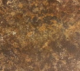
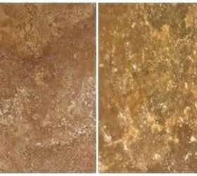
Our color application was as follows after applying the black primer:
Brown Feldspar
Chocolate Brown
Venetian Gold*
Inca Gold
Burnt Umber*
White Wash*
* = colors I added. The Venetian Gold is metallic, so it gave a nice shimmer underneath. (Real stone has silica and a little "sparkle.")
When I first did a test patch on black cardstock, I was happy with it, but the Husband wanted more of a contrast, especially since our cabinets are now white. So I threw in the Burnt Umber at the end to really warm things up.
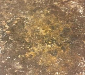
I very sparingly almost dry-sponged on the white lightly here and there...it added another nice contrast and made the overall finish look more "stoney."
The KEY to applying this is to do one color right after the other while still wet. We used slightly damp sponges, and I would apply one color with my husband following right behind me with the second color. Once all of the colors were applied, he would go over everything with a very lightly damp sponge in order to "smoosh" and blend the colors together to his heart's content. This provides a more blended look since the paints are still wet. The finish looks a lot less obviously sponged.
It's also very easy to correct any areas you want lighter or darker while they're still wet, then just sponge over the spot to blend. Another suggestion - take a break from it. Walk away, come back in an hour, and take a fresh look! You don't want to overdo it, either - you want some visual separation and noticeable concentrated spots here and there. Real stone certainly isn't uniform!

Original article and pictures take http://www.hometalk.com/13563405/painting-over-dated-formica site
Комментариев нет:
Отправить комментарий